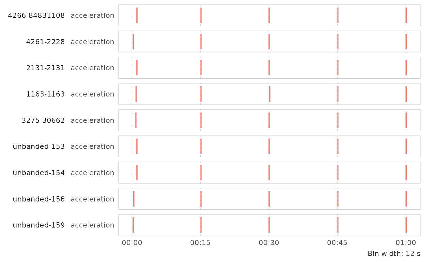
Visualize sample collection times from imu or timestamp vectors
Source: R/plot_sampling_effort.R
plot_sampling_effort.RdCreate a plot showing the sampling effort over time for a set of imu
or timestamp vectors. Use this to identify changes in sampling regimes over
the course of data collection.
Sample collection times are grouped into bins spanning a given time range. Each bin is shaded relative to the number of samples that falls within that bin for each input vector. Bins are grouped by input vector and optionally by a user-provided grouping factor (often identifying individual tracks).
Arguments
- ...
Any number of
imuor timestamp vectors. All vectors must be the same length. Timestamps can be inPOSIXct,POSIXlt,Date, or a number of seconds since1970-01-01 00:00:00 UTC.Dateobjects are treated as being recorded at midnight, UTC.- ids
Vector of IDs used to group the observations in
.... All observations for each group will be included in a single panel. Must be the same length as each of the vectors in....- bin_width
Width of the time bins within which samples are counted. Provided as a units object, a difftime object, or a numeric value which will be interpreted as seconds. By default, the time range of the plot is divided into roughly 300 bins.
Decrease the
bin_widthto increase plot resolution, at the expense of legibility for sparsely collected data.- from, to
Start and end timestamps defining the range within which samples will be counted. Accepts the same formats as timestamps in
.... By default, the full temporal extent of the data is used.
Value
A ggplot2::ggplot object, built from the data returned by
bin_samples().
Details
Sampling effort is calculated by
splitting the plotted time range into equal-width bins. The binned grid starts at
fromif provided. Otherwise, it starts at the closest multiple ofbin_widthat or before the first sample.counting the number of samples each sensor recorded in each bin, separately for every track.
dividing each count by the bin width, giving an effective sampling rate in Hz.
normalizing those rates within each input vector, so that each sensor's sampling effort values are relative to the maximum sampling effort recorded in that vector, across all groups in
ids.
The shade of each bin is mapped to effort with a square-root transform and is limited to a minimum alpha value of 0.28 to ensure sparse bursts remain visible. A bin in which a sensor recorded nothing is left blank, so a gap in a row reflects a period with no samples recorded.
Note that because the shade of each bin is normalized within each input
vector provided to ..., shade says nothing about the absolute sampling
rate of a vector, and shades cannot be compared across inputs.
Because normalization spans all groups in ids, panels can be compared
with one another, but a track that sampled less intensively than its peers
appears uniformly faint.
The time axis is drawn in the time zone of the first vector passed to ....
You can directly access the data produced by this calculation and passed to
the plot by calling bin_samples().
Extending the plot
The returned plot is a ggplot2::ggplot object and can therefore be modified
with further ggplot2 layers.
Every aesthetic is set on the tile layer rather than on the plot, so added
layers do not inherit aesthetics and must supply their own mappings. For
more customization, build your own plot based on the data produced by
bin_samples().
Note that the returned plot sets some default theme and scale parameters, which may be overwritten if replacing certain layers or theme elements (e.g., with a built-in ggplot2 theme).
The default theme includes these theme parameters:
panel.grid.major.y = element_blank()
panel.grid.minor = element_blank()
panel.grid.major.x = element_line(linetype = "dashed", color = "gray80", linewidth = 0.3)
panel.border = element_rect(color = "gray80", fill = NA, linewidth = 0.4)
strip.text.y.left = element_text(angle = 0, hjust = 1)
strip.placement = "outside"
plot.caption = element_text(color = "gray20")
See also
bin_samples() for the underlying counts.
plot_imu_trace() to plot the data values recorded by an imu vector.
Examples
alb <- albatrosses()
acc <- as_acc(alb)
tracks <- move2::mt_track_id(alb)
# Plot `imu` vectors by passing them directly
plot_sampling_effort(acc, ids = tracks)
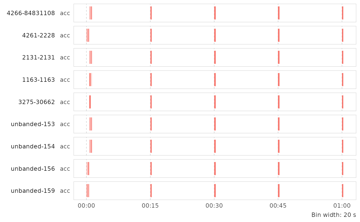
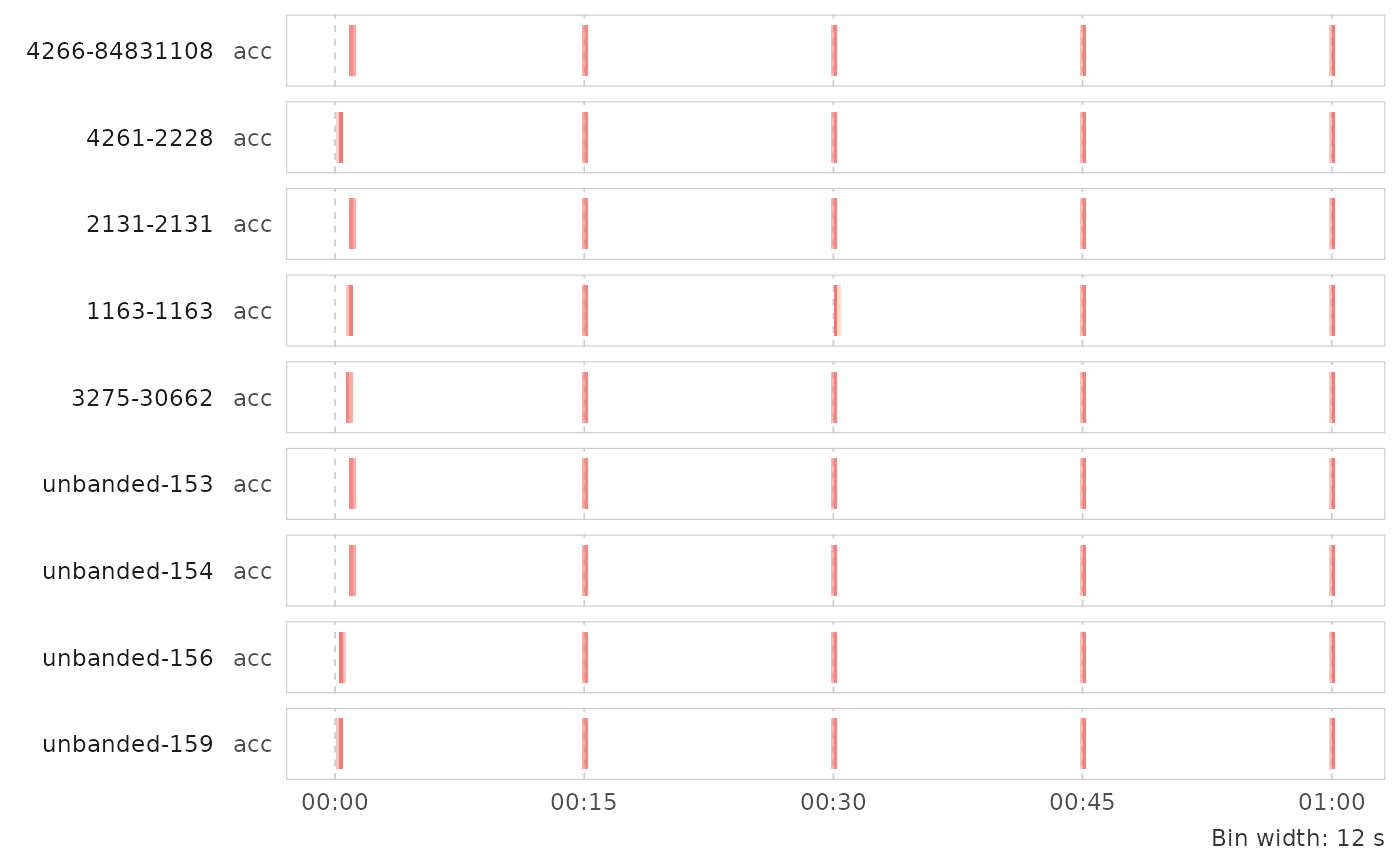 # Adjust bin width to adjust "resolution" of the plot
plot_sampling_effort(
acc,
bin_width = units::set_units(20, "s"),
ids = tracks
)
# Adjust bin width to adjust "resolution" of the plot
plot_sampling_effort(
acc,
bin_width = units::set_units(20, "s"),
ids = tracks
)
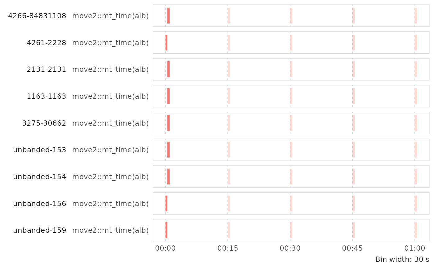
 # It is also possible to plot timestamp vectors.
plot_sampling_effort(
move2::mt_time(alb),
ids = tracks,
bin_width = units::set_units(30, "s")
)
# It is also possible to plot timestamp vectors.
plot_sampling_effort(
move2::mt_time(alb),
ids = tracks,
bin_width = units::set_units(30, "s")
)
 # When plotting multiple sources of data, they must be the same length
# and aligned with `ids`, if provided.
#
# For instance, to extract GPS coordinates from a move2, mask out the non-GPS
# observations, but leave them as `NA`:
gps <- replace(move2::mt_time(alb), sf::st_is_empty(alb), NA)
# This ensures GPS coordinates will be correctly grouped by `ids`:
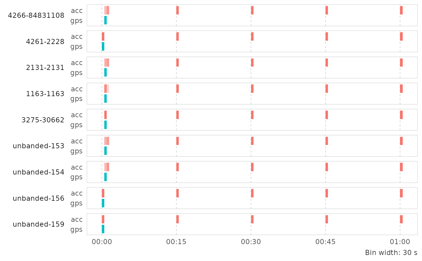
plot_sampling_effort(
acc,
gps,
ids = tracks,
bin_width = units::set_units(30, "s")
)
# When plotting multiple sources of data, they must be the same length
# and aligned with `ids`, if provided.
#
# For instance, to extract GPS coordinates from a move2, mask out the non-GPS
# observations, but leave them as `NA`:
gps <- replace(move2::mt_time(alb), sf::st_is_empty(alb), NA)
# This ensures GPS coordinates will be correctly grouped by `ids`:
plot_sampling_effort(
acc,
gps,
ids = tracks,
bin_width = units::set_units(30, "s")
)
 # Restrict the plot time axis with `from`/`to`
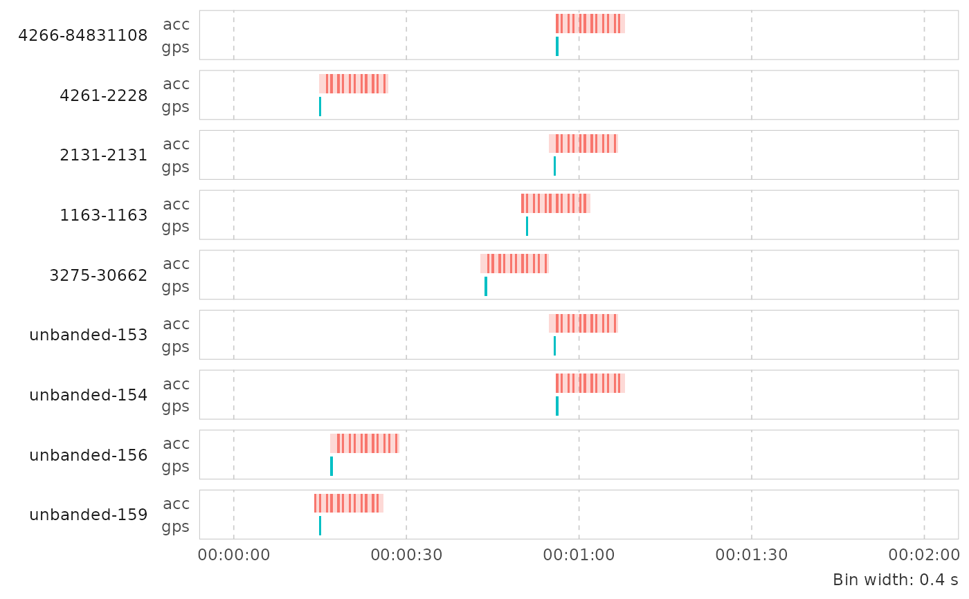
p <- plot_sampling_effort(
acc,
gps,
ids = tracks,
from = as.POSIXct("2008-07-27 00:00:00", tz = "UTC"),
to = as.POSIXct("2008-07-27 00:02:00", tz = "UTC")
)
p
# Restrict the plot time axis with `from`/`to`
p <- plot_sampling_effort(
acc,
gps,
ids = tracks,
from = as.POSIXct("2008-07-27 00:00:00", tz = "UTC"),
to = as.POSIXct("2008-07-27 00:02:00", tz = "UTC")
)
p
 # The plot can be modified like another ggplot2 plot
# (Note that modifying some layers may overwrite plot defaults and produce a
# slightly different layout)
library(ggplot2)
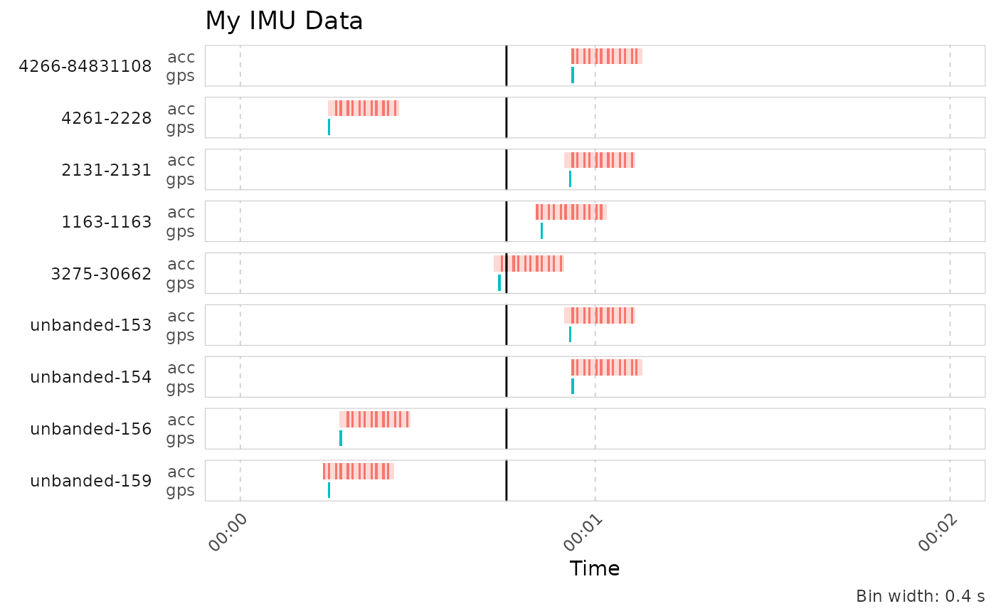
p +
geom_vline(xintercept = as.POSIXct("2008-07-27 00:00:45", tz = "UTC")) +
labs(title = "My IMU Data", x = "Time") +
scale_x_datetime(date_breaks = "1 min", date_labels = "%H:%M") +
theme(axis.text.x = element_text(angle = 45, hjust = 1))
# The plot can be modified like another ggplot2 plot
# (Note that modifying some layers may overwrite plot defaults and produce a
# slightly different layout)
library(ggplot2)
p +
geom_vline(xintercept = as.POSIXct("2008-07-27 00:00:45", tz = "UTC")) +
labs(title = "My IMU Data", x = "Time") +
scale_x_datetime(date_breaks = "1 min", date_labels = "%H:%M") +
theme(axis.text.x = element_text(angle = 45, hjust = 1))
 # Modify label names by naming the input vectors
plot_sampling_effort(acceleration = acc, ids = tracks)
# Modify label names by naming the input vectors
plot_sampling_effort(acceleration = acc, ids = tracks)